The iconic British paint brand Farrow and Ball recently added 9 new paint colours to its portfolio.
F&B haven’t done a colour refresh since 2016, so these colours are a real comment on what is trending right now. And we’re big fans. They are versatile, modern and striking.
If you’re looking for paint inspiration and want to be bang on trend – then the F&B 2019 collection is for you.
Let’s look at the brush on their latest paints.
1. School House White
www.farrow-ball.com/paint-colours/school-house-white
This ‘soft off-white’ is a new neutral to add to your colour plate. It has a warmer, ‘pinker’ tone compared to other traditional cool whites.
School House White is a friendly way to freshen up kitchens or bathrooms. A great old-school vibe!
2. Jitney
The next colour addition is ‘a relaxed brown based neutral’ called Jitney. According to F&B this colour is meant to remind us of lazy days by the sea (a Jitney, for those unaware, is the name of the bus that whisks New Yorkers to holiday at The Hamptons).
Use this colour for bedrooms and living spaces to create a soothing, relaxed ambiance.
We also love it as a great backdrop to other earthy colours and splashes of greenery.
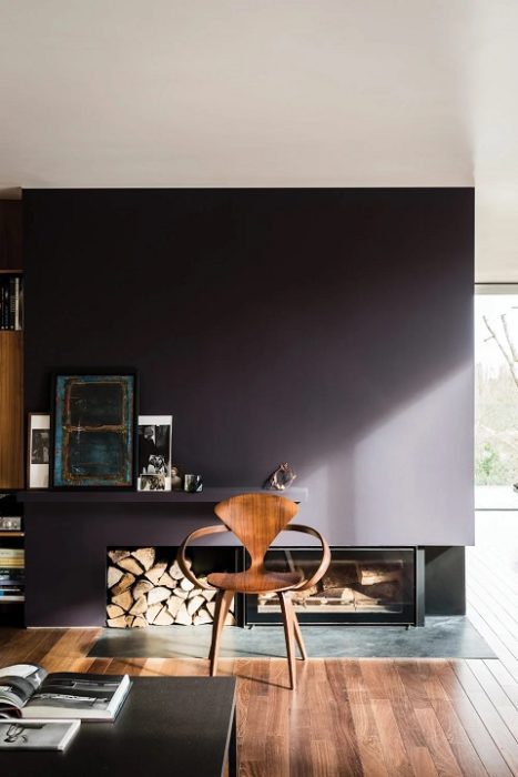
3. Paen Black
www.farrow-ball.com/paint-colours/paean-black
Sticking to a theme of warmer paint tones the next colour, Paen Black, is a softer take on black.
It has a red-base which makes this a much more muted colour to use, and much easier to incorporate than a solid black. A modern twist on a classic.
Inspiration for this new colour is said to be old leather church hymnals – Paen Black is a song of praise.
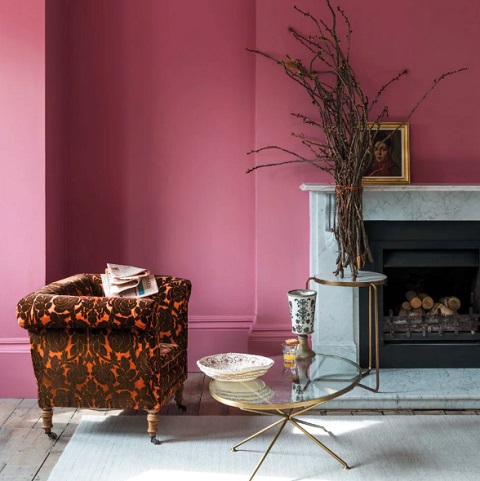
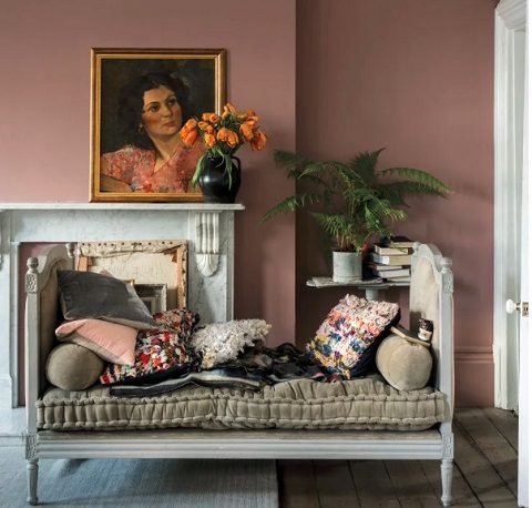
4. Sulking Room Pink
www.farrow-ball.com/paint-colours/sulking-room-pink
This one has my favourite name from the new collection – Sulking Room Pink!
Reminiscent of boudoirs (and so named after the French “bouder” – to sulk), this is a lovely muted pink colour. A gorgeous way to include pink to your rooms without overpowering it.
Sulking Room Pink also works perfectly in unison with traditional grey tones to warm up a room.
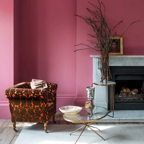
5. Rangwali
www.farrow-ball.com/paint-colours/rangwali
What a lovely happy colour! Inspired from the powder thrown during the Holi festival of colour in India – Rangwali is sure to bring a smile to your face.
It is one of the more dramatic colours in the new range, so use it to create a feature wall in your living room or bedroom.
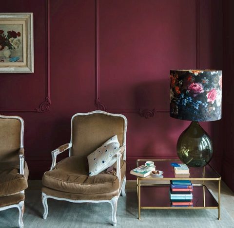
6. Preference Red
www.farrow-ball.com/paint-colours/preference-red
Another addition is Preference Red – a deep, rich, Baroque Red. This new hue is a lively fruity shade which gives another modern twist on a classic colour. Sophisticated and luxurious.
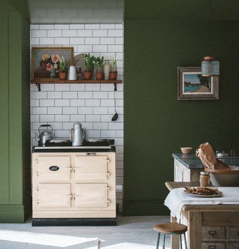
7. Bancha
www.farrow-ball.com/paint-colours/bancha
A green tea for your home! Bancha is the latest green shade to be added to the F&B collection.
We have seen a resurgence of olives, ferns and palm shades recently. This is another excellent way to add nature into the home.
Bancha is a dramatic colour, but inviting and warm at the same time.
8. Treron
www.farrow-ball.com/paint-colours/treron
This next shade is an evolution of their existing colour Pigeon – Treron being a green variant of the bird.
This darker colour has a grey-green base and is set to be a very versatile paint. Use Treron as an accent colour or as a base for other neutrals.
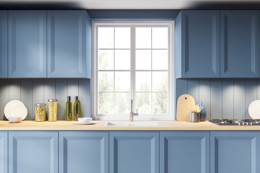
9. De Nimes
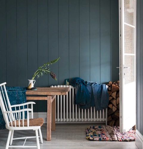
www.farrow-ball.com/paint-colours/de-nimes
This elegant new blue is bound to be a crowd pleaser. Its inspiration comes from the everyday workwear made in the French city Nîmes – denim. So, much like your favourite jeans, this paint colour can be dressed up or down.
This is my top colour from the new range and inspired the need to pick up a paintbrush… living spaces in darker shades are very instagramable right now!
Have you tired any of the new Farrow and Ball range?
Or got a new favourite colour to use in 2019?
Let us know what it is. And where you used it!


Leave a Reply